Political Optics
During political campaigns there is a rush to get content created for key platform topics to talking points on important legislative agendas. Almost all candidates utilize social media, traditional email lists, websites, and print marketing. They have a massive task- reach potential voters quickly and connect personally and politically. Not an easy task considering how short the political campaign lifespan can be during primaries.
Candidates need images for all of these marketing efforts. From the quick easy to read postcard send out to all registered voters to more in-depth content voters can research on websites and Facebook. The importance of good optics in a campaign cannot be understand. Again, the campaign has the task of quickly introducing the candidate to potential voters and score high on the likability scale.
Recently I worked with Sean Willcott who is running for a local office in Kansas and we spoke a lot about what kind of images he needed for their immediate media needs. We reviewed some general key values his campaign wanted to talk about and how he wanted to connect his message with his visuals.
For our first shoot they wanted to focus on two key areas - his family and him as a candidate. We did so with his Facebook page in mind as that what the initial primary campaign launch home base. But we also knew there would be print and web media needs down the road.
What to consider for political media images
Colors. Political campaigns are typically using versions of red, white, and blue for text, backgrounds etc. Wearing neutrals with minimal pattern pairs better with campaign text.
Environment and background. Every campaign is unique in who its primary audiences and issues are. Environment may play a huge role to connect with your intended audience and to position you. For example if you are wanting to connect with farmers and key farming issues, you will want to have farming, land, etc as part of your environment. It may feel disconnect to talk about farming values while walking urban streets. Or if your message is all about kitchen table issues— it may make sense to put you at a kitchen table.
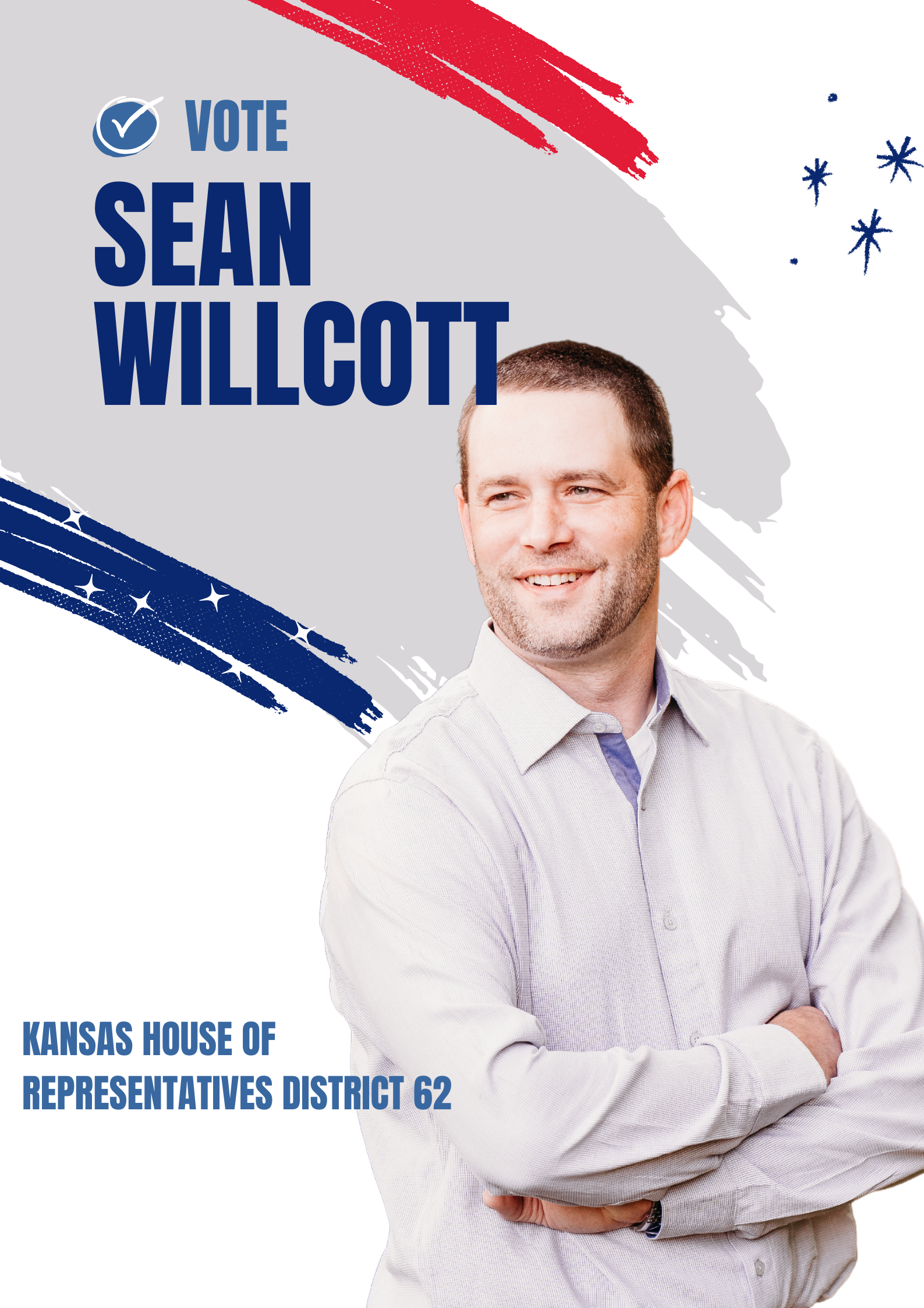
The good news with backgrounds — you can pretty easily remove them. Especially from standing full body images. You can see in the example below we removed Sean and placed him on a different background. We don’t need to photograph you on a white background or green screen to extract you and put you on any background.
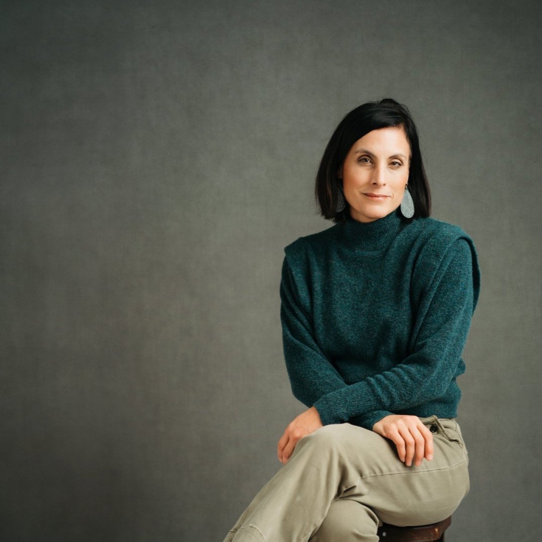
Headshot vs. branding-.Headshots typically are you looking at the camera— essentially a business portrait. Branding can be looser. It often works well to not be looking or be focused on an action when wanting portraits with some context. For example, Sean is a small business owner and creates craft beer. If what he does is important to the campaign it may make sense to capture content of him working. I believe there is a balance and having both is essential. You can’t go wrong with a great headshot— but you are up against a clock and connecting the candidate and their key values with the voting public quickly is essential… you need great branding.
Event pictures. I don’t think anything feels more authentic than images from the campaign trail. Well taken images from key speeches, rallies, campaign stops, etc are great for optics and storytelling. As a campaign you have to decide how you are going to capture those images.
Real vs. Staged. I get the question often in branding about how to capture the kinds of content you want— does it have to be real? Sometimes it is tough to get the images you need during real events. This is true for lots of content. Sometimes you need to stage a scene to remove unneeded distractions, coordinate colors or what people are wearing, to optimize a time of day etc. In branding we do this all the time to capture marketing images and political campaigns are no different.
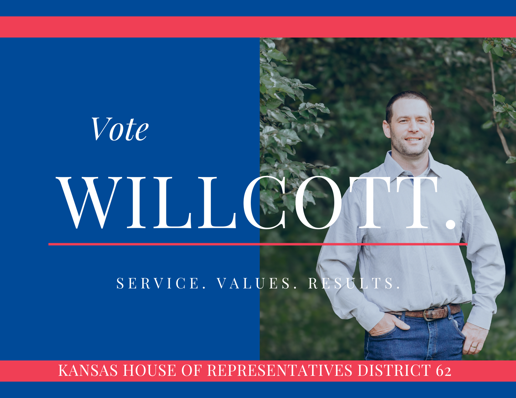
End use of Images. How you use your images matters and can impact the way we take them. Their final location- vertical instagram stories vs. horizontal website header… big difference. Are you planning to place text over the image and need negative space. Do you need really simple backgrounds for text readability. Great news — AI to the rescue. We an easily expand backgrounds if necessary expanding how we help you create content after the shoot.
Message. I saved this for last because I don’t want you to forget this! People are highly visual and your message can be made stronger if you have some key storytelling images. You may need a key prop, grouping of people, or even a specific location. Obviously knowing your message is essential and while campaigns can be somewhat fluid- you key messages should be identified from the start. Obviously you got into a race because you strongly believed in a few key issues and think you can make a different in moving the needle. Your message is most likely already identified— we just incorporate them with your images.
Here are some content I created to show examples. These are in no way generated by the Willcott campaign or represent their campaign.
Campaign optics can make or break a candidates changes to share their message. Honestly, viewers don’t spend the time they need to truly be informed unfortunately. Campaigns are a fast paced race and the right message and visuals from the beginning of the campaign can help you go the distance.


